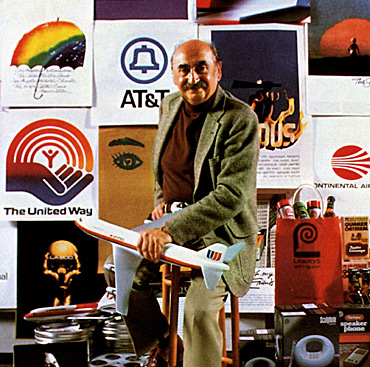
Saul Bass was both graphic designer and Academy Award winning filmmaker. However, he is most famously known for his animated motion picture title sequences. During his 40 year career Bass had worked with notable filmmakers such as Alfred Hitchcock, Otto Preminger, Stanley Kubrick, and Martin Scorsese. He created over 50 opening sequences for a range of films, including Sparticus, The Victors, It’s a Mad, Mad, Mad, Mad World, Goodfellas, Doc Hollywood, Cape Fear, and The Age of Innocence. Among his work are three famous title sequences: the animated paper cut-out of a heroin addict’s arm in Preminger’s The Man With the Golden Arm, the text utilized as a high-angle shot of the United Nations Building in Alfred Hitchcock’s North by Northwest, and the scrambled and disjointed text used for the opening sequence of Psycho.
Saul Bass also designed the sixth logo for the AT&T Bell system, and then designed the globe logo for AT&T after the breakup of Bell System. The logo he designed for Continental Airlines’ 1968 “jetstream” became one of the most recognized airline industry logos of the 1970s. His other corporate work includes United Airlines, Minolta, and Warner Communications. Other widely recognized logos by Bass are the United Way and Girl Scouts Logo and the Kleenex and Dixie logotypes. Bass also designed the main poster for the 1984 Los Angeles Olympic Games.
Born in the Bronx quarter of New York City on May 8, 1920, Saul Bass had an early developed interest in art. He studied painting at the Art Students League of Manhattan at the age of 15. Once old enough, he began attending classes taught by Gyorgy Kepes at Brooklyn College. Gyorgy Kepes was a Hungarian graphic designer who introduced Bass to László Moholy-Nagy’s Bauhaus style and Russian Constructivism. Bass worked as a commercial designer in New York until 1946. He moved to Los Angeles at that time, feeling creative constraints in New York. After freelancing for four years, Bass opened up his own studio producing work for advertising. In 1955 he renamed is studio Bass & Associates.
He began his Hollywood career by doing print work for film ads. During a collaboration with filmmaker Otto Preminger on a film poster for the 1954 film Carmen Jones, Preminger was impressed enough with Bass to ask him to produce the title sequence as well. With the new venture, Bass realized that opening sequences for movies could provide more than the opening credits, but as a way to make an experience to introduce the film. An effective opening sequence could enhance the overall experience for the audience as well as contribute to the overall mood and theme of the
 film.
film.
"My initial thoughts about what a title can do was to set mood and
the prime underlying core of the film's story, to express the story
in some metaphorical way. I saw the title as a way of conditioning
the audience, so that when the film actually began, viewers would
already have an emotional resonance with it"
Bass was the first to see the creative potential in something that would ordinarily appear mundane. The Man With the Golden Arm was a film by Preminger created in 1955 about a jazz musician’s struggle with his heroin addiction. The subject of the film proved to be too taboo for the mid 1950’s. With that in mind, Bass decided to create a controversial opening sequence for what will prove to be a controversial movie, featuring a black paper cut out of the arm of a heroin addict. He selected an arm as the central image, since the image of an arm has a strong relation to drug use. This opening sequence was how Bass became notorious in the film industry.
After working with Preminger, Bass began his work in kinetic typography for Alfred Hitchcock. Kinetic typography is an animation technique mixing motion with text. Text is shown over a period of time in such a way as to convey a particular idea or emotion. He created opening sequences for the films North by Northwest, Vertigo, and Psycho. In North by Northwest, the text for the credits would appear as if they “flew” in from off screen, then fade into the beginning of the film. His work was found to be revolutionary and innovative, making Saul Bass a revered graphic designer.
Bass moved away from the optical techniques he was a pioneer of to computerized titles during his work with Martin Scorsese on the opening sequence of Casino. While average patrons may not know of the name of Saul Bass, the style of his iconic film posters is surely recognized. The array of posters he designed includes The Shining, In Harms Way, One Two Three, Love in the Afternoon, Saint Joan, West Side Story, and Bunny Lake is Missing.
Bass was considered to have a gift for have the ability to identify a central image that defines the movie, then recreating the image to become the symbol of the movie by remodernizing it. Martin Scorsese described Bass’ style as creating: “an emblematic image, instantly recognizable and immediately tied to the film.” When Saul Bass died in 1996, the New York Times published his obituary hailing him as "the minimalist auteur who put a jagged arm in motion in 1955 and created an entire film genre…and elevated it into an art." It has been said that after watching one of Bass’ title sequences, one could walk out of the theater. In under a minute and using mainly visuals, he was able to summarize the film in its entirety.
Here are more examples of Saul Bass' work:


No comments:
Post a Comment